Colored Pencils; Which
are best?
In this
blog post I will be doing a similar review as I did with inking
pens writing out the different brands that I've used and saying
what I think of them and how they work.
Please keep in mind that I am also
thinking in terms of how I color and also from my skill level; And
also please remember that everybody has a preference I will not say
you need to get
anything, I will let you decide, I'll just say what I know and see
from my perspective on things.
Okay, lets begin!
Crayola:
Crayola is probably the most famous
because nearly every child (at
least in the US) has had at least on pack of crayolas (second
closest brand I believe would be RoseArt), these are actually
very good considering they are for children. I probably have between
all brands that I have, I have Crayola's most, some of them are about
10 years old (Orange is my most
common color for some reason) and they are still great. I
personally love them because they are harder than a better brand like
Prismacolor (if you use the
premier pencils). You can get a very wide range
of colors; here's a list of colors for the Crayola 64 pack.
Desaturated colors:
 |
| Image Not My Own |
|
Black
Slate
Silver
Grey
White
Toolbox
- Platinum
Cool Grey
Auro Metal Sarus
Reds:
Red
Red-Orange
Maroon
Mahogany
Rose Red
Yellows:
Yellow
Yellow Orange
Yellow-Green
-
 |
| Image Not My Own |
|
Bronze Yellow
Lemon Yellow
Harvest Gold
Gold
Oranges:
Orange
Mango
Light Orange
Peach
Browns:
Brown
Dark Brown
Light Brown
Meat Brown
Sandstorm
Taupe
Sand
-
Tan
Pinks:
Pink
Bubble Gum
Salmon
Pale Rose
- Magenta
- Rasberry
 |
| Image Not My Own |
|
Purples:
Violet
Mauve
Orchid
Amethyst
Greens:
Green
Guppie Green
Electric Green
Dollar Bill
UFO Green
Green-Blue
Pine Green
Jade Green
Aqua Green
Lime Green
Turquoise
Teal
 |
| Image Not My Own. |
|
Blues:
Blue
Navy Blue
Sky Blue
Cerulean
Ball Blue
Light Blue
Baby Blue
Spiro Disco Ball
There are also other colors in special
packs, their biggest pack of colors pencils is a 200 pack but the
catch is there's only 12 colors per pack or 240, this is mainly for
if you are running an art class with kids or a daycare or something
like that. It's called the Classic pack and it can be found
here.
There are also colored pencils that you
can erase, as well as mechanical colored pencils I do not own these,
they also sell “special” packs with “special colors”, prices
range but you can get a 64 pack of Crayolas for up to $12.00.
Crayolas blend reasonably not perfect
but reasonably and are good to layer with different colors and make a
visual nice texture.
For a beginner and more specifically a
young beginner with not much money these are good to pick up.
As a young non monetarily advanced
artist I say these are very nice to start with and to keep using
through the years. I haven't bought pencils from Crayola in years
because I keep having duplicates and such so I know they last a long
time.
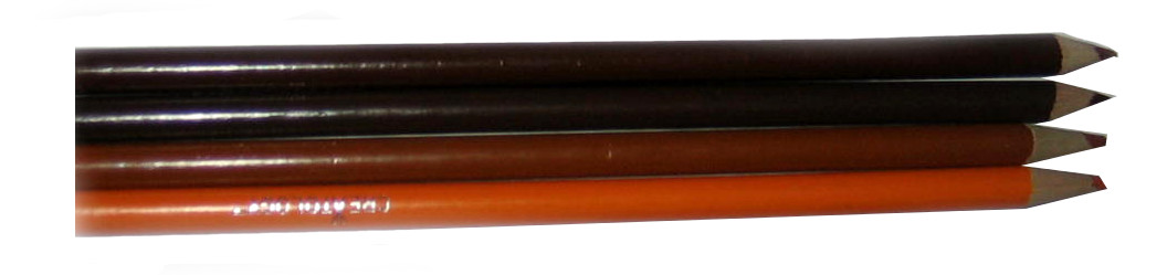
Creatology:
 |
| Picture from my personal box. |
|
Creatology is a company that sells
pencils exclusively at Micheals Craft stores, I have their 72 ct. Set
of colored pencils that were given to me as a gift. The colors aren't
named individuality so they're pretty much up to your own
interpretation. There are 36 colors and each pencil has a duplicate,
good if you have a favorite color because lasts longer or if you want
to share you have a duplicate and can work easy without having to
give the same pencil away. I do not know how much they cost, I cannot
find them online so I believe they are only available in stores.
Pros:
Cons:
They can be a bit sketchy. (Can
be good if you like that effect)
These colored pencils tend to get
dull rather quick and when sharpening them you loose a lot of
pencil.
More on the box than anything –
The box is horrible for storage you'll need another container. (I
wouldn't let this bother you too much but it's still worth noting)
These pencils don't blend very
good.
All in all, I don't
not recommend
them but I don't highly recommend them, I like them but I don't
prefer them. It's up to you.
Prismacolor:
 |
| Image Not My Own (From Amazon) |
Prismacolors are on the much higher end
of quality, the type I use are their Premier Pencils, but they also
sell Verithin pencils which I do not own but from what I've heard
about them they are much harder than the Premier pencils. Prismacolor
Premier pencils have 150 shades, they have many different sets, I
personally own the
Sanford
Prismacolor Premier Colored Pencil Set, 48/Tin it includes 48
different colors, depending on the pack also 2 “free” art stix
(normally both the same color) and a hand held pencil sharpener.
These are much softer than Crayola or other “Children's Brands”,
and they blend much better, but they also cost a lot more, depending
where you go a pack of 48 can range from $30.00-$72.00, I've had my
48 pack for about 3 years, I went through a time of not using them
much because I was scared I'd waste them but still it's 3 years! I've
used them the most in the past year and a half, my poor little
pencils some are down to almost nubs!
Here's a color Chart for all 150
colors:
 |
| Originally from: http://transientart.deviantart.com/art/Prismacolor-150-Premier-Colored-Pencil-Chart-273397018 |
|
 |
| Image Not My Own |
|
These pencils are best used with a
“Prismacolor Colorless Blender Pencil”, in short it's a pencil
that you use super fast to warm the wax causing it to become softer
than it already is and blending the wax together; The colorless
blender pencil also works good with Crayola and Crayons but not as
good at Prismacolor pencils because it's made specifically for that
type of wax.
My main “Con” for this would be
that these pencils tend to have their color points fall out, mine are
older so that might account for some of the problem, but I've read
places that they are not supposed to fall out but they do!
Prismacolors come in different
containers and can come un-sharpened and pre-sharpened, I recommend
personally get them un-sharpened, I've read that Sanford does not
sharpen their pencils evenly before selling and they put the point on
the end where the code number and color name is on some of the
pencils, which is important if you want to buy a specific pencil as
they can be sold individually in stores and online.
The Black Prismacolor has gained it's
own spotlight in a sense as Illustrator, Author and Youtube Drawing
Tutorial Sensation – Mark Crilley's Famous Black Pencil he uses in
his video is from Prismacolor Premier.
 |
Mark
Crilley Using A Black Prismacolor Premier from his "How
To Draw a "Realistic" Manga Face: Anger" video.
|
The white Prismacolor is good for
adding lighting to drawings colored with:
I do not recommend to use it for eye
shines, though, it's not thick enough, but that doesn't mean you
can't try and prove me utterly wrong!
EK
Memory Pencils:
These are very mild pencils both in
price and useability, they cost $ 1.50-13 Dollars depending where you
go for sets of 12. They have sets by color type groups like Primary,
Earth, etc.., . These pencils are in between Crayola and Prismacolor
in softness, they're blending is reasonable but not wonderful, they
were designed for memory books and crafting projects but they are
fine for coloring too, advertised as waterproof and fade proof.
I have pencils from 3 different sets
which are:
Primary Colors – The Basic
colors, vivid not very vast for 12 colors but it's still alright to
have.
Earth colors – Much warmer
tones, very “earthy” as they are so called.
Pastel - Much softer shades
than the two mentioned above, good for young looking images. They
are not as saturated but still pretty.
 |
| Images Not My Own - I put them all in one image |
If you are
interested in these I suggest doing your research a bit to get the
best price I've seen them sold very cheap then really expensive, it's
all about smart shopping!
Off Brands:
I've bought many
off brand colored pencils and they are alright, dollar stores and
other stores that seem random brands are a gold mine for super cheap
pencils, they aren't the best quality but sometimes you get those few
good pencils that have super nice colors. For $1-4 I'd say it's worth
a stab in the dark, if they don't work for you, you can always save
them for a child later on to use.
Notable mentions that I do
not own:
 Faber–Castle:
These are higher class pencils, I only own a 12 pack of
their watercolor-pencils and I like them, I do not know about their
other products.- Some Crayola Products are produced in their
factories.
Faber–Castle:
These are higher class pencils, I only own a 12 pack of
their watercolor-pencils and I like them, I do not know about their
other products.- Some Crayola Products are produced in their
factories.
 RoseArt:
A Child's company much like Crayola, I do not own a set of
these only a few randoms that I was given, from what I can tell they
are alright but I can't really have an opinion on them as I do not
own a set. - I do own, however, their markers and I like them.
RoseArt:
A Child's company much like Crayola, I do not own a set of
these only a few randoms that I was given, from what I can tell they
are alright but I can't really have an opinion on them as I do not
own a set. - I do own, however, their markers and I like them.
 Prismacolor
Verithin: I
do not own these as stated above but from what I've heard they are
harder, I also do not own any watercolor pencils from Prismacolor.
Prismacolor
Verithin: I
do not own these as stated above but from what I've heard they are
harder, I also do not own any watercolor pencils from Prismacolor.
Quick Note For Pencil
Care:
My key
to long pencil life is learn to work with them from super point all
the way down to flat, then sharpen them again (In
other words I'm stingy.),
and don't press so hard when you are trying to color big areas,
shadows and things like that pressing harder is good but still don't
press too awfully hard!! - You can break the point or make the
pencils dull quicker.
Also use a good
sharpener, a bad sharpener can break your points and you loose a lot
of pencil, either get a good hand-held sharpener, or get a good
electric sharpener, I have my sharpener for almost or about 5 or 6
years and she's still kick'n at sharpening thems pencils!
Another tip, if you dislike the container that your pencils come in, sort them by color order with rubber bands (blues with blues, yellows, reds, etc..) and put them in something else, like a tote-bag or a better resealable container. - Even if you like the container I still recommenced color ordering your pencils, no matter how many you have; It's so much easier to color when they are in color order to start so you're not searching for the color you want in a confusing mix up. - It's Worth The Time!
_________________________
I hope this has helped some of you artists out there!
Happy coloring!
May God Bless You, Your Family, Friends; Along With The Health Of Yourself, Family, And All That Know You. ~ Amen
~ Firefly
Useful
Links:
Would
You Like To Read More Blog Posts Similar To This One? Take A Look At
The Official Blog
Archive.
Would
You Like To See My Drawings? Click here.
Have A
Question?

 Materials:

 B Prismacolor Pen