
Hey everyone! Miss me?...Probably not but look at me and my bad self I finally found motivation to talk about something. A Challenge! A Challenge posed to us by Jake Parker, a well known Illustrator, Animator, and Artist. He's the creator of #InkTober which is a totally different subject in and of itself....So yeah back on topic!
Today I tried out the #8MinuteDraw, where you take 8 minutes to draw the same picture 6 times. You draw the first for 4 minutes, second for 2 minutes, third for 1 minute, fourth for 30 seconds, fifth for 15 seconds and finally the last time for 5 seconds. And Yes this is a challenge if you do not have all your art tools handy, and I being blonde kept forgetting to get my knead-able eraser.... Here's my journey that I took today!
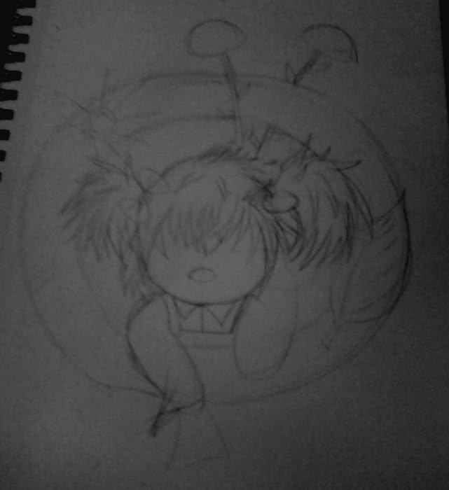
 I generally stuck with things I knew so I would be able to feel out the "project" and see how much I liked it. So the first idea that was stuck in my head was a mushroom and a butterfly. In general 4 minutes was actually quite giving since the drawing was so small I wasn't sure of what to do to make it more detailed without making it look like a black blob. - Materials used : Mechanical Pencil, 08 Prismacolor Fine Line Marker, Sketch paper/book.
After this, I was pleasantly surprised to find that I had fun. Which is saying something since I don't like pressure, and timed pressure is even worse. The pen I chose however was a bad idea, I ended up using the 08 twice once for this and the other time for the next one; Another bad idea was to not get my knead-able eraser for a while...I didn't get it until I did this challenge about 4 or 5 times...something like that I don't know at the moment. - Tip #1: If you are going to do this, make sure you have all of your tools handy now or else this isn't happening with any ease at all. Drawing a picture in 5 seconds is hard enough, please have your tools. - Another thing to note is by the time you get to the one minute image you can forget sketching, you are going in there with the pen outright (unless you only use pencil then pfff to the pen).
After my mushroom, I decided to draw a face, so I went with an elf face...why? No idea but it was awesome!!!! LoL! ....Anyway, in drawing the face I did the dumb thing of no guild-lines to start, which for some people that's fine, for me...it's not. But I think it was alright...I guess...the second one I like better and that one I had less time for. - Materials used : Mechanical Pencil, 08 Prismacolor Fine Line Marker, Sketch paper/book.

After this, I learned my lesson with the 08 pen. For me it was too thick for fast lines and adding details. So I switched to an 05 which is smaller, it was better but in the end was too thick as well, but I did 2 rounds of the challenge with it.
 So now, I'm thinking I was to do something else I'm generally good at...So I picked a sunflower...Which for some reason wasn't going smooth for me but in the end I think was alright..I suppose anyway. Lol!! By the time 5 seconds came I forgot what I was drawing so that's why it looks like road kill.... -
Materials used : Mechanical Pencil, 05 Prismacolor Fine Line Marker, Sketch paper/book.
Next up, I thought about drawing a cup of tea so that's just what I did! I wasn't sure of the design so this one took a bit of sculpting with the pencil until I came up with something I liked. A lot of the inking was freestylin' since I didn't know what I was doing. But I think this one is one of my favorites. Around this time as the time passed for each I started to inspect, see and think "Which one of these details can I eliminate to make the general idea", from looking at the image you can see that the pattern on the cup is what changed the most drastically in the overall aspect of things (though the shape did too that was due to lack of time and a sketch more than intentional). - Materials used : Mechanical Pencil, 05 Prismacolor Fine Line Marker, Sketch paper/book.

By this time I was realizing a new problem, my pens are too small for big black areas so I kept in my hat that I needed a thicker black pen for some areas. - Tip #2: Keep 2 pens ready and uncapped for this challenge, so if you want to ad line weight or contrast you'll be ready for the task. (just remember to re-cap when you are done else they will dry out)

For this one, all I really have to say is the inspiration for this is a pillow I have that has teddy-bears on it.
I also started using the 03 pen for my drawings so I could add more details.
Materials used : Mechanical Pencil, 03 Prismacolor Fine Line Marker, Sketch paper/book.
This one I actually had to find something to do, 4 minutes was generous in this case. I ended up adding pointless details like the butterfly and ladybug. It was interesting to see how long I could keep those little details without wasting time. In the end 15 and 5 second(s) I ditched the bugs I could hardly get the rose or vase never-mind other details. Another thing to note is I sketched in the sketch for the 2minute point so I could just color it in as I inked the vase to save time and to make it as close to the original as I could.
Materials used : Mechanical Pencil, 03 Prismacolor Fine Line Marker, Sketch paper/book.

 These next two I used an 06 Sakura Pigma Sensi pen for the thick lines and an 03 Prismacolor for other lines. I picked out an eye for the first one since I generally do eyes half okay even without a sketch and I wanted to see what I do with it. And for the mouth/nose I originally just wanted to draw lips but I got that done so fast I added a nose, I find it interesting to see how an after thought ended up making it to every version to follow. By the last 3 drawings for each round I just used the 03 so I could get as much done as possible without delay. I also found it interesting that you can see how my foundation in the manga style comes out in the eye when trying to simplify and speed up the process - Materials used : Normal #2 HB Pencil, 03 Prismacolor Fine Line Marker, 06 Sakura Pigma Sensi, Sketch paper/book.
For the eyes and mouth/nose and all the drawings to follow my sketch was not with the mechanical pencil but with a normal #2 HB pencil, I found the mechanicl pencil was too dark to draw with. Tip #3: If a tool is fighting you or is making another aspect of your artwork too hard to complete then try and find a more effective replacement ASAP. Don't do what I did and keep fighting it hoping it will magically work out. Chances are, it won't.
At this point I was running out of ideas looking around where I was trying to find something to be inspired by so I ended up drawing my pitiful little flip-phone. And this time I switched back and forth with the 06 and 03 even in the 1 minute square, upping the challenge a bit. I was trying to eliminate things to go faster but there wasn't much to eliminate so I ended up not doing the solid black area in black since that was the most time consuming. I wasn't overly happy with this one but eh C'est la vie. - Materials used : Normal #2 HB Pencil, 03 Prismacolor Fine Line Marker, 06 Sakura Pigma Sensi, Sketch paper/book.

 Again I say I was running out of ideas so this was a basically just lets draw a bow and see what happens. For this one I switched as much I could between the 03 and 06 all the way until the end as much as was possible. I like it, I think the very last one is kinda cute.... - Materials used : Normal #2 HB Pencil, 03 Prismacolor Fine Line Marker, 06 Sakura Pigma Sensi, Sketch paper/book.
I figured since I've gotten some practice doing this 8 minute challenge maybe I should try a face again, so this time I did a male elf face. I kinda was lost doing that since I had no idea what details to add to a face that small. But in the end I think I have improved even after doing just this challenge because the time before I didn't get a face on the head for the 5 second slot, this time I got the hair, face and head...they're ugly but I got it on the page. I suppose that means I improved. I also find it interesting that as with the eye before, when rushing I went back to a very manga look to make things faster. - Materials used : Normal #2 HB Pencil, 03 Prismacolor Fine Line Marker, 06 Sakura Pigma Sensi, Sketch paper/book.

And finally this one. I needed a final idea...I ended up seeing a thumb tack that's on the wall (there is a reason it's there! Lol) and I figured eh idk what else to draw but lets start with a thumb tack. That went somewhat fast so I added an eraser, paperclip and a staple. I ended up adding every element in the 5 second drawing...though you can't really tell what anything is there is a representation of each thing. I also attempted to switch between pens as much as possible. - Materials used : Normal #2 HB Pencil, 03 Prismacolor Fine Line Marker, 06 Sakura Pigma Sensi, Sketch paper/book.

So in the end I really reccomend doing this, it's only 8 minutes and it's actually fun!
If you want to try this out Jake Parker made a timer which can be found here.
And if you want towatch his video about it click here.
Enjoy and thanks for reading.
~ God Bless ~
~ Firefly
#8MinuteDraw
Today I tried out the #8MinuteDraw, where you take 8 minutes to draw the same picture 6 times. You draw the first for 4 minutes, second for 2 minutes, third for 1 minute, fourth for 30 seconds, fifth for 15 seconds and finally the last time for 5 seconds. And Yes this is a challenge if you do not have all your art tools handy, and I being blonde kept forgetting to get my knead-able eraser.... Here's my journey that I took today!
 I generally stuck with things I knew so I would be able to feel out the "project" and see how much I liked it. So the first idea that was stuck in my head was a mushroom and a butterfly. In general 4 minutes was actually quite giving since the drawing was so small I wasn't sure of what to do to make it more detailed without making it look like a black blob. - Materials used : Mechanical Pencil, 08 Prismacolor Fine Line Marker, Sketch paper/book.
After this, I was pleasantly surprised to find that I had fun. Which is saying something since I don't like pressure, and timed pressure is even worse. The pen I chose however was a bad idea, I ended up using the 08 twice once for this and the other time for the next one; Another bad idea was to not get my knead-able eraser for a while...I didn't get it until I did this challenge about 4 or 5 times...something like that I don't know at the moment. - Tip #1: If you are going to do this, make sure you have all of your tools handy now or else this isn't happening with any ease at all. Drawing a picture in 5 seconds is hard enough, please have your tools. - Another thing to note is by the time you get to the one minute image you can forget sketching, you are going in there with the pen outright (unless you only use pencil then pfff to the pen).
After my mushroom, I decided to draw a face, so I went with an elf face...why? No idea but it was awesome!!!! LoL! ....Anyway, in drawing the face I did the dumb thing of no guild-lines to start, which for some people that's fine, for me...it's not. But I think it was alright...I guess...the second one I like better and that one I had less time for. - Materials used : Mechanical Pencil, 08 Prismacolor Fine Line Marker, Sketch paper/book.

After this, I learned my lesson with the 08 pen. For me it was too thick for fast lines and adding details. So I switched to an 05 which is smaller, it was better but in the end was too thick as well, but I did 2 rounds of the challenge with it.

Materials used : Mechanical Pencil, 05 Prismacolor Fine Line Marker, Sketch paper/book.
Next up, I thought about drawing a cup of tea so that's just what I did! I wasn't sure of the design so this one took a bit of sculpting with the pencil until I came up with something I liked. A lot of the inking was freestylin' since I didn't know what I was doing. But I think this one is one of my favorites. Around this time as the time passed for each I started to inspect, see and think "Which one of these details can I eliminate to make the general idea", from looking at the image you can see that the pattern on the cup is what changed the most drastically in the overall aspect of things (though the shape did too that was due to lack of time and a sketch more than intentional). - Materials used : Mechanical Pencil, 05 Prismacolor Fine Line Marker, Sketch paper/book.

By this time I was realizing a new problem, my pens are too small for big black areas so I kept in my hat that I needed a thicker black pen for some areas. - Tip #2: Keep 2 pens ready and uncapped for this challenge, so if you want to ad line weight or contrast you'll be ready for the task. (just remember to re-cap when you are done else they will dry out)

For this one, all I really have to say is the inspiration for this is a pillow I have that has teddy-bears on it.
I also started using the 03 pen for my drawings so I could add more details.
Materials used : Mechanical Pencil, 03 Prismacolor Fine Line Marker, Sketch paper/book.
This one I actually had to find something to do, 4 minutes was generous in this case. I ended up adding pointless details like the butterfly and ladybug. It was interesting to see how long I could keep those little details without wasting time. In the end 15 and 5 second(s) I ditched the bugs I could hardly get the rose or vase never-mind other details. Another thing to note is I sketched in the sketch for the 2minute point so I could just color it in as I inked the vase to save time and to make it as close to the original as I could.
Materials used : Mechanical Pencil, 03 Prismacolor Fine Line Marker, Sketch paper/book.

 These next two I used an 06 Sakura Pigma Sensi pen for the thick lines and an 03 Prismacolor for other lines. I picked out an eye for the first one since I generally do eyes half okay even without a sketch and I wanted to see what I do with it. And for the mouth/nose I originally just wanted to draw lips but I got that done so fast I added a nose, I find it interesting to see how an after thought ended up making it to every version to follow. By the last 3 drawings for each round I just used the 03 so I could get as much done as possible without delay. I also found it interesting that you can see how my foundation in the manga style comes out in the eye when trying to simplify and speed up the process - Materials used : Normal #2 HB Pencil, 03 Prismacolor Fine Line Marker, 06 Sakura Pigma Sensi, Sketch paper/book.
For the eyes and mouth/nose and all the drawings to follow my sketch was not with the mechanical pencil but with a normal #2 HB pencil, I found the mechanicl pencil was too dark to draw with. Tip #3: If a tool is fighting you or is making another aspect of your artwork too hard to complete then try and find a more effective replacement ASAP. Don't do what I did and keep fighting it hoping it will magically work out. Chances are, it won't.
At this point I was running out of ideas looking around where I was trying to find something to be inspired by so I ended up drawing my pitiful little flip-phone. And this time I switched back and forth with the 06 and 03 even in the 1 minute square, upping the challenge a bit. I was trying to eliminate things to go faster but there wasn't much to eliminate so I ended up not doing the solid black area in black since that was the most time consuming. I wasn't overly happy with this one but eh C'est la vie. - Materials used : Normal #2 HB Pencil, 03 Prismacolor Fine Line Marker, 06 Sakura Pigma Sensi, Sketch paper/book.

 Again I say I was running out of ideas so this was a basically just lets draw a bow and see what happens. For this one I switched as much I could between the 03 and 06 all the way until the end as much as was possible. I like it, I think the very last one is kinda cute.... - Materials used : Normal #2 HB Pencil, 03 Prismacolor Fine Line Marker, 06 Sakura Pigma Sensi, Sketch paper/book.
I figured since I've gotten some practice doing this 8 minute challenge maybe I should try a face again, so this time I did a male elf face. I kinda was lost doing that since I had no idea what details to add to a face that small. But in the end I think I have improved even after doing just this challenge because the time before I didn't get a face on the head for the 5 second slot, this time I got the hair, face and head...they're ugly but I got it on the page. I suppose that means I improved. I also find it interesting that as with the eye before, when rushing I went back to a very manga look to make things faster. - Materials used : Normal #2 HB Pencil, 03 Prismacolor Fine Line Marker, 06 Sakura Pigma Sensi, Sketch paper/book.

And finally this one. I needed a final idea...I ended up seeing a thumb tack that's on the wall (there is a reason it's there! Lol) and I figured eh idk what else to draw but lets start with a thumb tack. That went somewhat fast so I added an eraser, paperclip and a staple. I ended up adding every element in the 5 second drawing...though you can't really tell what anything is there is a representation of each thing. I also attempted to switch between pens as much as possible. - Materials used : Normal #2 HB Pencil, 03 Prismacolor Fine Line Marker, 06 Sakura Pigma Sensi, Sketch paper/book.

So in the end I really reccomend doing this, it's only 8 minutes and it's actually fun!
If you want to try this out Jake Parker made a timer which can be found here.
And if you want towatch his video about it click here.
Enjoy and thanks for reading.
~ God Bless ~
~ Firefly


