Moko-Young's Factoid Firefly album on Photobucket
Showing posts with label Prismacolor. Show all posts

Saturday, April 2, 2016

Dry Mediums Versus Wet Mediums

Hi! This week I'm going to talk about some of the major differences between wet and draw traditional art mediums. I won't go in to express details but just some general things to keep in mind.


Okay, lets begin!

Control-ability:


This is in general easier with dry media; Colored pencils and charcoal pencils can be sharpened to a point and do fine details, whereas things like watercolors and gouache is a lot harder to control because you need brushes and water. Markers are much easier if you want wet media, and the harder medium for dry would
be soft and oil pastels as they are neither brushed on nor always in pencil form but are closer to being small blocks most of the time, but you can but soft pencils in some places as pencils.


Blending:


Blended with baby-oil and blender pencil
Blending things like colored pencils is based off of layering and burnishing , there are many techniques including using a blender pencil, a white colored pencil, or baby-oil to blend colored pencils. For graphics pencils and soft pastels there are blending stubs that are made to blend the more powedery medium together, you can also use cotton swabs you buy from the bath section of he store or your finger, but I've had some unhappy accidents with using my fingers for blending like forgetting which finger had which color then I mixed and made an ugly color...ugggghhhh don't do that!

Watercolor blended with more watercolor and water
For watercolors you need water to blend, and water-based markers...well...you pretty much don't have a good blending capability with them unless you want to use them also as watercolors (how to do that will be
talked about another time). For alcohol-based markers they're blended using a colorless blender and eachother, different brands have colorless blenders and I have never used one but I have watched many other artists use them and they are quite useful.


Color Depth:

This is something that can be a bit irritating but c'est la vie. With wet media the color you put down is never the color that dries, it always dries lighter. Depending on the medium and quality, the color, texture, and depth will change from not so bad to drastic. For example, you can put down a wash of watercolor from a decent brand, the color you put on is vibrant and saturated, once it dries the white of the paper comes out a bit and lightens the color. Markers are the same, and a side tip never believe the color on the barrel of the marker, test it first, the colors they put on the barrel are never accurate; But anyway back on point... Here's another example: If you put down a medium purple but it looks very dark wait a few minutes for it to dry it will lighten up a bit. 

Colored with Colored pencil - Background with watercolor

Dry mediums on the other hand, the color you put down is the color you get, there is no drying time so whatever you see on the paper is what you will always see (as long as you consider aging which cause things to fade over time). Another thing to remember is the color of your paper will account for
the color of the medium you put down. If you have a black toned paper, don't expect to see any marker unless you have some kind of neon paint marker. If you use something like colored pencils on the other hand, you're much more likely to see the pencil. Lighter colors are obviously recommended.
____

Okay, after reading these 3 contrasting differences which one do I think is better?
None! Each are different, and special, taking days, months and/or years of practice. And to be honest, I generally do not use only one medium in a drawing. Even in a colored pencil dominated drawing I will use watercolor for the background and/or pastels. For a marker piece I'll use colored pencils to shade. For watercolors I'll use water-based markers and colored pencils to shade. Just because these things are different doesn't mean they can't work together. I find it a bit amazing actually that each one of these mediums when used alone or together can all make photo-realistic artwork or super cartoony artwork. Some do it better than others, but the results are astonishing.

So where to start? Well, that's also for another time, but if I was to say anything, I'd say a graphite normal pencil, an eraser that works, and a sketch book. That's really all you need.

Now go out there and draw something! The world is looking for new things to discover!

Thank you for reading.


~ God Bless ~


~ Firefly

Saturday, March 12, 2016

Some Drawings I've Done Over The Past Few Months

Okay I know the middle or early week would have been better but I'm a lazy jerk and never got the nerve to actually write a decent article so we get these pieces of artwork instead. I'm sorryyyy!!!

Okay here we go, some of these are going to be mentioned in future posts. I'll say a little about some of the artworks. And yeah...it'll explain itself.


Monochrome inked with brown pen and colored with watercolor.


Sunflower with bees, colored with sharpies and colored pencils, on mixed media paper the background is watercolor and the outlines are with inking pens and a sharpie fine tipped marker.


These first two are done on printer cardstock using Prismacolor multi-liners and Sharpies to color. (The light blue from the dress is a Prismacolor marker [I only have 3 of those]).


This next one is I believe the first drawing I've ever colored not in monotone while having the outlines in brown. Colored using watercolor, crayola markers and soft pastels on mixed media paper.


I was watching Jake Parker videos while drawing these from photo reference. I didn't aim for realism just a likeness of the different leaves. The top row left to right: Oak, Ash - Botton Row Left to Right: Maple, Birch.
Colored pencil, pen, soft pastel on sketch paper.


A pen drawing using color inking pens and IDentipens all from Sakura brand.

Opaque watercolor painting on mixed media paper.


Colored pencil drawing on watercolor paper with a watercolor background.


I have drawn more but I think that's enough for now.

I hope you enjoyed these drawings, if you did please +1 on google plus and show other people.
Thank you!


~ God Bless~

~ Firefly

Wednesday, January 6, 2016

[Traditional Art] Fluffy Mei - Colored Pencil Drawing - First Drawing of 2016!!

Haiiiiiiiiiiiiiiiiii! Yes yes I hardly post art anymore...I know...I'm sorry! It's just a pain in the neck. There are many drawings I haven't posted, I might make a video or something for 2015 to make up for it...But anyway back to what I've done now!
Process Pictures

Some might remember Mei the feather-tailed-rabbit...An invention of my childhood don't judge me! Lol
Well anyway, she's getting a revisit....And a make-over of sorts. This is a colored pencil drawing of her if she was actually furry now just a chibi character...I hope you enjoy!


Time Taken: Approx - 7-9 hours


Media:


  • 36 - Prismacolor Colored Pencils
  • 10 - EK Memory Pencils
  • 8 - Crayola Colored Pencils


  • 6 - Other (random/ off brands)
  • Kneadable eraser - lighting lines, erasing
  • Normal Pencil - Sketching
  • Canson Mixed Media Paper
  • Sharpener


May God Bless And Keep In Good Health Yourself And All You Know And Love ~ Amen


~ Firefly


Useful Links:
Would You Like To See More Of My Drawings? Click here.
Would You Like To Read My Blog Posts? Take A Look At The Official Blog Archive.


Have A Question?
Ask The Firefly!

Friday, September 11, 2015

Inking Tips: Solid Vs Loose Lines

In this post we're going to talk a little about inking. I've spent a little more time with pens and ink so in my tests and drawings I've learned a few things that I'd like to share. I will sperate this in to two sections: Solid vs Loose Lines and Texture/Shading. This isn't extensive but I hope it's helpful in the long run!

Note: When I say inking, I mean art pens, not a brush or fountain pens, though these things might apply to those as well. I am talking about art pens like Prismacolor pens or Sakura Micron (or pigma) pens (or other pens like them, there are other brands as well).


So, without any further ado, lets begin!


Solid Vs Loose Lines: 


I've learned in recent months and really over the year that just because something is outlined that doesn't mean that the lines themselves have to be totally hard in nature. For example, if I drew a cartoon cat face I could ink with hard lines and you can tell he's fuzzy, or I could ink with looser more fluid lines not following the exact curvature of the face and he could almost appear to feel furry. He's still a cartoon but he's got more detail.

Neither one is better than the other but they are different. However if you like to color with a looser medium like watercolor, or a more detail oriented medium like colored pencils (pencil crayons in some countries) then maybe the looser style is more fitting. Of course it depends on the subject matter.

In the drawing below the inking on the character is loose and the inking on the poppy flower is solid. Knowing when to combined styles is key to making a picture coherent and not just a rambled mess.  Another thing to notice in this drawing is that there are different line thicknesses. The pattern on the dress has thing lines the fur on the character is thicker as well as the outline of the flower itself. It's all about finding what looks good.


Combining styles, knowing when, and creating something nice comes with practice and also some knowlage of yourself. Your style might be different than mine, so as I say these things it's not THE WAY it's just how I see things, take what's useful and ignore what's not....Anyways, moving on!

Texture and Shading:

There are many ways to add texture and shading while using pen, it can be VERY time consuming but it is well worth the effort.

 Within the styles there are many things you can do, a few are:  Hatching, cross-hatching, circles, scribbles, lines, and dots. Each of these have their place and are great for texture and shading, as well as fun patterns if you like artwork that isn't a subject oriented but an abstract style.

As a few examples I drew grapes, a tulip and an eye to show some of the things you can do with ink.


Grapes:


With the grapes I added a lot of black areas, these show contrast, three-dimensionality , and also some shading. I also did cross hatching on the grapes and the leafy part as well as scribbles on the grapes that would be more shaded. The section that says highlights refers  to those little parts I "roped off" that show where light would be hitting the subject.


Tulip:

For the tulip, I also did some contrast with the highlights and cross-hatching, but I also added some lines along the edge of the flower following the curvature, it's a more subtle looking approach to shading lovely for "softer" shadows.  I also added cross hatching in the more shaded areas.


Eye:

The eye shows fluidity with the eye-lashes, making fast but calculated strokes can make your artwork look much more "alive". I also used lines to the hair of the eyebrows, also using fast movement to make the hair look more fluid and textured. Highlights as  well on the white of the eye (since it's really off white and moist you would have a highlight sometimes) and the iris itself.


Another thing you can do with ink is make areas black (or dark if you're using a colored pen) then go over it in white. In this picture I colored the edge of the butterfly-wings black then went over them with a white pen. - You will also notice that I used different pen sizes as well as did lots of contrast black. Also if you look at the picture you'll see I added dots which add texture and a pattern to the butterfly.


In this drawing you can see I used hatching to texture the sash, circles in the paisleys and scribbles to show the shadow of the neck. There's also some contrast shading too.


Overall these are some things I've learned and I hope they help you as well!
Thank you for reading and God bless.


~ Firefly

Tuesday, April 21, 2015

More Sketches!

Here are some more practices....These are over the past 2 weeks...or so. I hope anyone who wants to look enjoys these! :3


Sketched with a normal pencil then colored with soft pastel. After Ink is added (a sharpie ultra fine point). The horses I drew from memory the birds and cats I followed tutorials.


Random doodling with oil pastels.


 The apple and pear I think are both soft pastel and colored pencils. Other stuff is a sharpie pen.


Messing with baby oil and oil pastels with colored pencils.


This is more like a painting than a sketch but I was practicing so I guess it counts.
I followed a tutorial in a book for drawing the Cosmo, the rose is just how I draw a rose...My watercolor pencil skills almost ruined this, I just took over it with Raphael watercolors instead and went with it. - Watercolor, white pen, pencil for sketching, kneadable eraser.


May God bless all you and all you love as well as they health of yourself an all that know you! ~ Amen


~ Firefly


Useful Links:

Would You Like To See More Of My Drawings? Click here.
Would You Like To Read My Blog Posts? Take A Look At The Official Blog Archive.
Have A Question?


Monday, August 19, 2013

Colored Pencils: Are They Really Worth My Money?

Colored Pencils: Are They Really Worth My Money?

Opening:

Many people buy colored pencils because they are deemed cheaper than markers, and paint can often seem like something the “important” people use, but I am here to tell you that colored pencils are worth the money, whether you buy the “good” quality ones or if you buy the ones from cheaper brands like Crayola ™ or RoseArt ™.


Main Thought:

Sometimes colored pencils get a bad rap, it's like people think colored pencils it's just Crayola and after all “dats kidz stuff!” Although depending on the brand this is true to a point, but colored pencils take as much skill as any other type of media, learning it and mastering it is key; Basically become a Zen Ninja and learn the way of the pigmented graphite! You may think that you cannot make good art with cheap pencils, I beg to differ! I believe that if you can't master the cheap the better/ more expensive will be wasted trying to learn the media; Granted brand and type are different in hardness, color depth and blending, but if you can get good at cheap then you will be able to expand your color variety and also texture, not to mention you can show how pro you are coloring a super cool drawing using kids pencils...!

I use many types of pencils, namely: Prismacolor Premier, Crayola, EK Memory and also many off brands, I will say that I adore some of the cheaper pencils, they are so nice!

This picture is an example of works that can be done with cheaper colored pencils:

Bigger Version Here.


Although the majority is Prismacolor colored pencils (19) in this image, there are also 15 lesser branded pencils, Namely: Crayola and EK Memory, and also 3 off-branded pencils (dollar-store pencils) and Crayola being the majority.

Another example would be this drawing:

Image Taken From An Earlier Blog Post Which Can Be Found Here.


Although it's not the best artistic feat, it's (near if not total) majority of colored pencils are Creatology colored pencils, which on my scale of pencils are on the minor end of the artistic quality “food chain”. Don't think you're cheap for getting colored pencils!

Other artists have much more time and talent dedicated to the usage of colored pencils, look on YouTube and you'll find many artists!


Mixed media:


Blog Post here.
I'm very much a “Mixed Media” - “Artist”, I love to mix up different types of media, put it together, and make something beautiful! Colored pencils have become a literal foundation for coloring my drawings on paper.

When I say foundation I mean, first thing on the paper is normally colored pencil(s), for me it adds texture, depth, as well as texture both rough and smooth, it makes my markers (which are almost exclusively kids markers) slip about on the waxy base and go on much smoother and can even be blended with my finger or tissue. They are also make a very nice paper stiffener, I am currently in a “pencil only” sketch book, so to color with markers is not ideal, but still possible!

Blog Post can be found here.
My tip to you would be to layer the colored pencils on top of each other to make a thick waxy “coat” over the pores of the paper, also I'd recommend to get a “colorless blender pencil”; This is a colorless wax type pencil that you use to blend pencil together, the softer the pencils the more the blender-pencil will do it's job, for this Prismacolor is best as it's the pencil the blender-pencil was designed to work with, but it works somewhat if you mix brands and it works oddly enough nicely on crayons.

The one I use is from Prismacolor, I'm not sure if other brands make it but it's totally possible.

The Images in this section are examples of Mixed Media Drawings.


Storage:

Ways to store:

  • Rubber Bands
  • Tupperware containers (small for colors, or a (few maybe) bigger ones to store bound colored pencils)
  • Bags (I have sewn bags with zippers my mother made me)
  • Storage Units with smaller drawers or cubby compartments.

Please, this is a personal plea, when storing your colored pencils please, I beg thee with ever fiber of my being...put them in color order...Nothing is more irritating and inconvenient (to me) than having a bunch of pencils (or markers) not in color order! Let me tell you some of the good things that come from doing this!!

  • Coloring is more efficient
  • Coloring Trains of thought will not crash as you look for a certain color
  • You will realize when you are out of a color so you're prepared before starting a picture with certain colors in mind.
  • You will feel good inside
  • I will not come to your house to do it for you....That would be awkward...!!!!


Please, put them in color order!

Other things I would like to note is, when putting them in color order, also put them in brand order.
If you use Tupperware containers to store your pencils put each color in rubber bands, blues all together, pinks, greens, etc..., we all have a certain way to think of colors so I shall not say what order to set the pencils, but have some kind of order. Trust me it helps!!
I normally separate brand and color so lets say I have Crayola in Oranges and RoseArt, I'll put the RoseArt Oranges together and the Crayola Together within brand.

I'm getting irritating now, I'm sorry!


Conclusion:


Pencils are useful! Don't diss our graphic friends, embrace them with love and hugs!

If you want to read up on various brands I wrote a review and comparison on 4 different brands in detail and lightly touch on a few other various brands and types. The post can be found here.

I hope this was useful! Now go out there and create something beautiful and epic for all the world to see!


May God Bless You, Your Family, Friend; Along With The Health Of Yourself, Family, Friends, And All Who Know You. ~ Amen


~ Firefly


Useful Links:

Would You Like To Read More Blog Posts Similar To This One? Take A Look At The Official Blog Archive.
Would You Like To See My Drawings? Click here.

Have A Question?


Tuesday, June 25, 2013

Color Guide - Skin Toned Pencils

Color Guide - Skin Toned Pencils


This post will be about the different possible colors for skin tones using colored pencils, if you'd like to read about the following pencil brands click here.


Note 1: These color tones are a matter of opinion what looks like a Skin Tone.

Note 2: These Are Only Natural Skin Tones, All Other Tones Are Up For Personal Preference Only.

Note 3: I only talk of shading within brands but I personally mix brands to color and shade because of their different waxes and hardness-es.


Prismacolor Premier

Prismacolor codes colors both by name and code I will post both.
  • Burnt Ocher, PC943 -Reddish orange toned brown good for many darker races.
  • Sienna Brown, PC945 – A bit harsher brown but still reasonable in color and saturation, semi red tinted but very brown nonetheless. (Shades “Burnt Ocher, PC943”)
  • Light Umber, PC941 – Much less saturated, kinda tree barkish in color but it's still good for darker skin tones. (Shades “Sienna Brown, PC945”)
  • Light Peach, PC927 – Much like the default skin tone for Anime style, that peachy fleshy tone, Not overly pale semi saturated.
  • Peach, PC939 – Best as a shading color for “Light Peach, PC927 “, unless you like people very orange in skin color. - Preference.
  • Cream, PC914 – This is good for some skin tones, some people do have a yellowish complexion (Chinese for example) but used wrong your person doesn't look very good, it's a touchy color.
  • Yellow Ochre, PC942 – Only good really for shading “Cream, PC914”.


Crayola

Crayola has a few colors as well for skin tones, these don't blend nearly as well as Prismacolors do though, so be sure to put your shading in before the wax builds up too much, part of this is to not press your base colored pencil so hard and add the shading with the base color after you put the really dark shadows in, else things will be a bit odd looking!


  • Brown – Very dark color brown, good for darker skinned people and also shades “Light Brown”.
  • Light Brown- About a third to a fourth less as dark as “Brown” and a bit more saturated than “Brown” as well; It's good for shading Tan as well.
  • Taupe – This is a paler brownish color, kinda has a bit of a grey tint in it too but it does look a bit like a skin tone for some people.
  • Tan – A nice balanced color, very brown influenced but lighter in color and a bit more peachy looking; it's good for shading “Peach” with the darker shades.
  • Peach – Similar to “Light Peach, PC927” In the Prismacolor Premier Section; Shaded well by “Tan” and “Yellow Orange”.


EK Memory Pencils

EK labels their pencils by both color name and a circle around a number, but since I don't know how to put a circle around a number I will use “( )”.


  • Soft Orange, (2) – Similar to “Light Peach, PC927” In the Prismacolor Premier Section and “Peach” in the Crayola Section – Only a little paler; Shaded well by “Medium Orange (28)” and depending on how saturated you like your shading by “Orange, (45)”.
  • Medium Orange, (28) – Similar to “Peach, PC939” Prismacolor – Only a little less saturated. Shaded by “Orange, (45)”.
  • Tree Bark, (9) – Similar to “Burnt Ocher, PC943” with a bit less reddish orange but still has a saturated look to it.
  • Chestnut, (10) – Similar to Crayola's “Light Brown”. 


Other

Creatology and Other off brands have skin tones but no name to their tones so it's very much up to your own interpretation of these colors. - I've taken a picture though of the skin tone pencils I own, I cannot name any brand names as I no longer have their boxes to say who made them, but I can say I bought them all in dollar stores (Family Dollar, Dollar Tree, etc..).


Off Brand
Creatology


I hope this gave you at-least a basic guideline, I wanted to have each color shown but the pictures I took look terrible and I don't know how to make the background white without messing the color's actual appearance. - I can however direct you to a color chart that you can find the colors I mentioned for the Prismacolor Premier Pencils. (That was a very confusing sentence!)


Chart Here.


May God Bless You, Your Family, Friends; Along With The Health Of Yourself, Family, And All Who Know You. ~ Amen


~ Firefly


Useful Links:

Would You Like To Read More Blog Posts Similar To This One? Take A Look At The Official Blog Archive.
Would You Like To See My Drawings? Click here.

Have A Question?

Sunday, June 23, 2013

Colored Pencils; Which are best?

 Colored Pencils; Which are best?


In this blog post I will be doing a similar review as I did with inking pens writing out the different brands that I've used and saying what I think of them and how they work.

Please keep in mind that I am also thinking in terms of how I color and also from my skill level; And also please remember that everybody has a preference I will not say you need to get anything, I will let you decide, I'll just say what I know and see from my perspective on things.

Okay, lets begin!


Crayola:


Crayola is probably the most famous because nearly every child (at least in the US) has had at least on pack of crayolas (second closest brand I believe would be RoseArt), these are actually very good considering they are for children. I probably have between all brands that I have, I have Crayola's most, some of them are about 10 years old (Orange is my most common color for some reason) and they are still great. I personally love them because they are harder than a better brand like Prismacolor (if you use the premier pencils). You can get a very wide range of colors; here's a list of colors for the Crayola 64 pack.

Desaturated colors:
  1. Image Not My Own
    Black
  2. Slate


  3. Silver
  4. Grey
  5. White
  6. Toolbox
  7. Platinum
  8. Cool Grey
  9. Auro Metal Sarus

Reds:
  1. Red
  2. Red-Orange
  3. Maroon
  4. Mahogany
  5. Rose Red

Yellows:
  1. Yellow
  2. Yellow Orange
  3. Yellow-Green
  4. Image Not My Own
    Bronze Yellow
  5. Lemon Yellow
  6. Harvest Gold
  7. Gold

Oranges:
  1. Orange
  2. Mango
  3. Light Orange
  4. Peach

Browns:
  1. Brown
  2. Dark Brown
  3. Light Brown
  4. Meat Brown
  5. Sandstorm
  6. Taupe
  7. Sand
  8. Tan


Pinks:
  1. Pink
  2. Bubble Gum
  3. Salmon
  4. Pale Rose
  5. Magenta
  6. Rasberry
Image Not My Own

Purples:


  1. Violet
  2. Mauve
  3. Orchid
  4. Amethyst


Greens:
  1. Green
  2. Guppie Green
  3. Electric Green
  4. Dollar Bill
  5. UFO Green
  6. Green-Blue
  7. Pine Green
  8. Jade Green
  9. Aqua Green
  10. Lime Green
  11. Turquoise
  12. Teal
Image Not My Own.


Blues:
  1. Blue
  2. Navy Blue
  3. Sky Blue
  4. Cerulean
  5. Ball Blue
  6. Light Blue
  7. Baby Blue
  8. Spiro Disco Ball


There are also other colors in special packs, their biggest pack of colors pencils is a 200 pack but the catch is there's only 12 colors per pack or 240, this is mainly for if you are running an art class with kids or a daycare or something like that. It's called the Classic pack and it can be found here.
There are also colored pencils that you can erase, as well as mechanical colored pencils I do not own these, they also sell “special” packs with “special colors”, prices range but you can get a 64 pack of Crayolas for up to $12.00.

Crayolas blend reasonably not perfect but reasonably and are good to layer with different colors and make a visual nice texture.

For a beginner and more specifically a young beginner with not much money these are good to pick up.

As a young non monetarily advanced artist I say these are very nice to start with and to keep using through the years. I haven't bought pencils from Crayola in years because I keep having duplicates and such so I know they last a long time.


Creatology:

Picture from my personal box.
Creatology is a company that sells pencils exclusively at Micheals Craft stores, I have their 72 ct. Set of colored pencils that were given to me as a gift. The colors aren't named individuality so they're pretty much up to your own interpretation. There are 36 colors and each pencil has a duplicate, good if you have a favorite color because lasts longer or if you want to share you have a duplicate and can work easy without having to give the same pencil away. I do not know how much they cost, I cannot find them online so I believe they are only available in stores.

Pros:
  • You have doubles of each color making the colors last longer.
  • They are very light to work with.
  • Most likely cheap.
Cons:
  • They can be a bit sketchy. (Can be good if you like that effect)
  • These colored pencils tend to get dull rather quick and when sharpening them you loose a lot of pencil.
  • More on the box than anything – The box is horrible for storage you'll need another container. (I wouldn't let this bother you too much but it's still worth noting)
  • These pencils don't blend very good.

All in all, I don't not recommend them but I don't highly recommend them, I like them but I don't prefer them. It's up to you.

Prismacolor:

Image Not My Own (From Amazon)
Prismacolors are on the much higher end of quality, the type I use are their Premier Pencils, but they also sell Verithin pencils which I do not own but from what I've heard about them they are much harder than the Premier pencils. Prismacolor Premier pencils have 150 shades, they have many different sets, I personally own the Sanford Prismacolor Premier Colored Pencil Set, 48/Tin it includes 48 different colors, depending on the pack also 2 “free” art stix (normally both the same color) and a hand held pencil sharpener. These are much softer than Crayola or other “Children's Brands”, and they blend much better, but they also cost a lot more, depending where you go a pack of 48 can range from $30.00-$72.00, I've had my 48 pack for about 3 years, I went through a time of not using them much because I was scared I'd waste them but still it's 3 years! I've used them the most in the past year and a half, my poor little pencils some are down to almost nubs!

Here's a color Chart for all 150 colors:
Originally from: http://transientart.deviantart.com/art/Prismacolor-150-Premier-Colored-Pencil-Chart-273397018


Image Not My Own
These pencils are best used with a “Prismacolor Colorless Blender Pencil”, in short it's a pencil that you use super fast to warm the wax causing it to become softer than it already is and blending the wax together; The colorless blender pencil also works good with Crayola and Crayons but not as good at Prismacolor pencils because it's made specifically for that type of wax.

My main “Con” for this would be that these pencils tend to have their color points fall out, mine are older so that might account for some of the problem, but I've read places that they are not supposed to fall out but they do!

Prismacolors come in different containers and can come un-sharpened and pre-sharpened, I recommend personally get them un-sharpened, I've read that Sanford does not sharpen their pencils evenly before selling and they put the point on the end where the code number and color name is on some of the pencils, which is important if you want to buy a specific pencil as they can be sold individually in stores and online.

The Black Prismacolor has gained it's own spotlight in a sense as Illustrator, Author and Youtube Drawing Tutorial Sensation – Mark Crilley's Famous Black Pencil he uses in his video is from Prismacolor Premier.

Mark Crilley Using A Black Prismacolor Premier from his "How To Draw a "Realistic" Manga Face: Anger" video.


The white Prismacolor is good for adding lighting to drawings colored with:

  • Pencil then marker over the top,
  • Marker alone,
  • And mixed media with Watercolor over the top.

I do not recommend to use it for eye shines, though, it's not thick enough, but that doesn't mean you can't try and prove me utterly wrong!

EK Memory Pencils:


These are very mild pencils both in price and useability, they cost $ 1.50-13 Dollars depending where you go for sets of 12. They have sets by color type groups like Primary, Earth, etc.., . These pencils are in between Crayola and Prismacolor in softness, they're blending is reasonable but not wonderful, they were designed for memory books and crafting projects but they are fine for coloring too, advertised as waterproof and fade proof.

I have pencils from 3 different sets which are:

  • Primary Colors – The Basic colors, vivid not very vast for 12 colors but it's still alright to have.
  • Earth colors – Much warmer tones, very “earthy” as they are so called.
  • Pastel - Much softer shades than the two mentioned above, good for young looking images. They are not as saturated but still pretty.
Images Not My Own - I put them all in one image

If you are interested in these I suggest doing your research a bit to get the best price I've seen them sold very cheap then really expensive, it's all about smart shopping!


Off Brands:


I've bought many off brand colored pencils and they are alright, dollar stores and other stores that seem random brands are a gold mine for super cheap pencils, they aren't the best quality but sometimes you get those few good pencils that have super nice colors. For $1-4 I'd say it's worth a stab in the dark, if they don't work for you, you can always save them for a child later on to use.

Notable mentions that I do not own:


Faber–Castle: These are higher class pencils, I only own a 12 pack of their watercolor-pencils and I like them, I do not know about their other products.- Some Crayola Products are produced in their factories.

RoseArt: A Child's company much like Crayola, I do not own a set of these only a few randoms that I was given, from what I can tell they are alright but I can't really have an opinion on them as I do not own a set. - I do own, however, their markers and I like them.

Prismacolor Verithin: I do not own these as stated above but from what I've heard they are harder, I also do not own any watercolor pencils from Prismacolor.


Quick Note For Pencil Care:

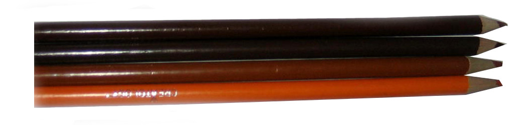
My key to long pencil life is learn to work with them from super point all the way down to flat, then sharpen them again (In other words I'm stingy.), and don't press so hard when you are trying to color big areas, shadows and things like that pressing harder is good but still don't press too awfully hard!! - You can break the point or make the pencils dull quicker.

Also use a good sharpener, a bad sharpener can break your points and you loose a lot of pencil, either get a good hand-held sharpener, or get a good electric sharpener, I have my sharpener for almost or about 5 or 6 years and she's still kick'n at sharpening thems pencils!

Another tip, if you dislike the container that your pencils come in, sort them by color order with rubber bands (blues with blues, yellows, reds, etc..) and put them in something else, like a tote-bag or a better resealable container. - Even if you like the container I still recommenced color ordering your pencils, no matter how many you have; It's so much easier to color when they are in color order to start so you're not searching for the color you want in a confusing mix up. - It's Worth The Time!

 _________________________

I hope this has helped some of you artists out there!
Happy coloring!


May God Bless You, Your Family, Friends; Along With The Health Of Yourself, Family, And All That Know You. ~ Amen


~ Firefly

Useful Links:

Would You Like To Read More Blog Posts Similar To This One? Take A Look At The Official Blog Archive.
Would You Like To See My Drawings? Click here.

Have A Question?