In this post we're going to talk a little about inking. I've spent a little more time with pens and ink so in my tests and drawings I've learned a few things that I'd like to share. I will sperate this in to two sections: Solid vs Loose Lines and Texture/Shading. This isn't extensive but I hope it's helpful in the long run!
So, without any further ado, lets begin!
 I've learned in recent months and really over the year that just because something is outlined that doesn't mean that the lines themselves have to be totally hard in nature. For example, if I drew a cartoon cat face I could ink with hard lines and you can tell he's fuzzy, or I could ink with looser more fluid lines not following the exact curvature of the face and he could almost appear to feel furry. He's still a cartoon but he's got more detail.
Neither one is better than the other but they are different. However if you like to color with a looser medium like watercolor, or a more detail oriented medium like colored pencils (pencil crayons in some countries) then maybe the looser style is more fitting. Of course it depends on the subject matter.
In the drawing below the inking on the character is loose and the inking on the poppy flower is solid. Knowing when to combined styles is key to making a picture coherent and not just a rambled mess. Another thing to notice in this drawing is that there are different line thicknesses. The pattern on the dress has thing lines the fur on the character is thicker as well as the outline of the flower itself. It's all about finding what looks good.

Combining styles, knowing when, and creating something nice comes with practice and also some knowlage of yourself. Your style might be different than mine, so as I say these things it's not THE WAY it's just how I see things, take what's useful and ignore what's not....Anyways, moving on!
There are many ways to add texture and shading while using pen, it can be VERY time consuming but it is well worth the effort.
Within the styles there are many things you can do, a few are: Hatching, cross-hatching, circles, scribbles, lines, and dots. Each of these have their place and are great for texture and shading, as well as fun patterns if you like artwork that isn't a subject oriented but an abstract style.
As a few examples I drew grapes, a tulip and an eye to show some of the things you can do with ink.
With the grapes I added a lot of black areas, these show contrast, three-dimensionality , and also some shading. I also did cross hatching on the grapes and the leafy part as well as scribbles on the grapes that would be more shaded. The section that says highlights refers to those little parts I "roped off" that show where light would be hitting the subject.


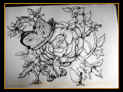
Another thing you can do with ink is make areas black (or dark if you're using a colored pen) then go over it in white. In this picture I colored the edge of the butterfly-wings black then went over them with a white pen. - You will also notice that I used different pen sizes as well as did lots of contrast black. Also if you look at the picture you'll see I added dots which add texture and a pattern to the butterfly.
In this drawing you can see I used hatching to texture the sash, circles in the paisleys and scribbles to show the shadow of the neck. There's also some contrast shading too.

Overall these are some things I've learned and I hope they help you as well!
Thank you for reading and God bless.
~ Firefly
Note: When I say inking, I mean art pens, not a brush or fountain pens, though these things might apply to those as well. I am talking about art pens like Prismacolor pens or Sakura Micron (or pigma) pens (or other pens like them, there are other brands as well).
So, without any further ado, lets begin!
Solid Vs Loose Lines:

Neither one is better than the other but they are different. However if you like to color with a looser medium like watercolor, or a more detail oriented medium like colored pencils (pencil crayons in some countries) then maybe the looser style is more fitting. Of course it depends on the subject matter.
In the drawing below the inking on the character is loose and the inking on the poppy flower is solid. Knowing when to combined styles is key to making a picture coherent and not just a rambled mess. Another thing to notice in this drawing is that there are different line thicknesses. The pattern on the dress has thing lines the fur on the character is thicker as well as the outline of the flower itself. It's all about finding what looks good.

Combining styles, knowing when, and creating something nice comes with practice and also some knowlage of yourself. Your style might be different than mine, so as I say these things it's not THE WAY it's just how I see things, take what's useful and ignore what's not....Anyways, moving on!
 Texture and Shading:
There are many ways to add texture and shading while using pen, it can be VERY time consuming but it is well worth the effort.
Within the styles there are many things you can do, a few are: Hatching, cross-hatching, circles, scribbles, lines, and dots. Each of these have their place and are great for texture and shading, as well as fun patterns if you like artwork that isn't a subject oriented but an abstract style.
As a few examples I drew grapes, a tulip and an eye to show some of the things you can do with ink.
Grapes:
With the grapes I added a lot of black areas, these show contrast, three-dimensionality , and also some shading. I also did cross hatching on the grapes and the leafy part as well as scribbles on the grapes that would be more shaded. The section that says highlights refers to those little parts I "roped off" that show where light would be hitting the subject.

Tulip:
For the tulip, I also did some contrast with the highlights and cross-hatching, but I also added some lines along the edge of the flower following the curvature, it's a more subtle looking approach to shading lovely for "softer" shadows. I also added cross hatching in the more shaded areas.
Eye:
The eye shows fluidity with the eye-lashes, making fast but calculated strokes can make your artwork look much more "alive". I also used lines to the hair of the eyebrows, also using fast movement to make the hair look more fluid and textured. Highlights as well on the white of the eye (since it's really off white and moist you would have a highlight sometimes) and the iris itself.
Another thing you can do with ink is make areas black (or dark if you're using a colored pen) then go over it in white. In this picture I colored the edge of the butterfly-wings black then went over them with a white pen. - You will also notice that I used different pen sizes as well as did lots of contrast black. Also if you look at the picture you'll see I added dots which add texture and a pattern to the butterfly.

In this drawing you can see I used hatching to texture the sash, circles in the paisleys and scribbles to show the shadow of the neck. There's also some contrast shading too.

Overall these are some things I've learned and I hope they help you as well!
Thank you for reading and God bless.
~ Firefly